A New Brand, a New Website
Digital Vision started in 2010. By this year the studio was doing new work in an old coat. So the brand got rebuilt, and this time it finally looks like the work.
What came out
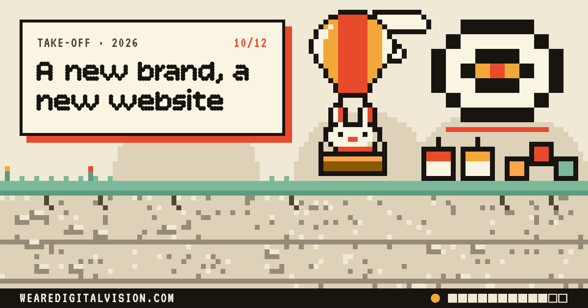
- A look of our own. Warm paper, ink, coral and amber. Headings in a dot-matrix typeface. Windows, folders and sticky notes, like an old desktop. No gradients, no stock photos.
- A new website, rebuilt in May and reworked all autumn: clearer pages for each kind of work, a blog, and the Feed, a running stream of what we're making.
- Print pieces: a poster, business cards, flyers and a lot of stickers.
- One Voice, a free tool on our site that helps a business owner find their own plain words and use them the same way everywhere.
- A design bar. A written minimum for anything we show a client, with real examples, so quality doesn't depend on how the day went.
Why it lifted off
The brand came out of the work, not a mood board. The windows and folders came from our own website, which had used them since May, and the print pieces carried them off the screen.
What I learned
Write your quality bar down, with pictures. Once it's on paper, you can hold every piece of work to it, including your own.
Where it sits now
The website, the print and the brand pack are in step, give or take a tagline. The Feed is where new work shows up first.
Working with ClaudeI ask for a design review on everything, then I keep going. Every element goes through round after round of my own edits until it feels personal, not like something a machine made.